RNA-seq解析を試してみよう #
- 今回もコードを隠しておきました。
- まずはAIに聞いてみましょう。
- もちろん、課題だけではなく、課題をやる過程で新しく疑問や不明点が出てきたらどんどんAIに聞きましょう。
- 例:このコードは何の意味があるか解説して。z-scoreってなに?信頼楕円とは?
0. 関連チュートリアル #
1. データの準備(Raw Countsデータ & TPMデータ) #
- 今回はすでにtibble形式にまとめたデータを用意してあるのでダウンロードしてください。
- ダウンロードしたファイルはプロジェクト内の
dataフォルダに保存してください。
Google Drive
上記のデータは以下のサイトからダウンロードしたものです。
- GDC Data Portal: 大腸癌のRNA-seqデータ。
- GTEx Portal: 正常大腸のRNA-seqデータ。
※ public データのダウンロードとクリーニングが実は最難関かもしれませんので、最後に紹介します。
2. データの読み込みとlog変換 #
library(tidyverse)
library(here)- まずはデータを読み込んでどのようなデータなのか調べてみます。
- RNA-seqのデータはとても大きいので、全体像をただ見て把握するのは困難です。
- そこで、データを要約してくれる関数や図を使って全体像を把握します。
# データの読み込み
counts <- read_csv(here("data", "TCGA_GTEx_colon_counts_tibble.csv"))
here()関数 #
- here()関数はファイルのパスを指定するための関数です。
- この関数を使うと、相対パスを絶対パスに変換してくれます。
- 絶対パスを自分で書くのはめんどくさいので相対パスをよく使いますが、相対パスだとうまく動かなくなる場合があります。
- パスを手書きするならそれぞれ以下のようになります。
- 相対パス:
data/TCGA_GTEx_colon_counts_tibble.csv- 絶対パス:
/home/user/proj/{プロジェクト名}/data/TCGA_GTEx_colon_counts_tibble.csv"here("data", "TCGA_GTEx_colon_counts_tibble.csv")とだけ書いて実行し、本当に絶対パスが出力されるか確認してみましょう。
Rows: 61569 Columns: 103
── Column specification ────────────────────────────────────────────────────────
Delimiter: ","
chr   (3): gene_id, gene_name, gene_type
dbl (100): TCGA-D5-5540, TCGA-EI-6509, TCGA-A6-6137, TCGA-QG-A5Z2, TCGA-AA-3...

ℹ Use `spec()` to retrieve the full column specification for this data.
ℹ Specify the column types or set `show_col_types = FALSE` to quiet this message.
metadata <- read_csv(here("data", "TCGA_GTEx_colon_metadata_tibble.csv"))Rows: 100 Columns: 210
── Column specification ────────────────────────────────────────────────────────
Delimiter: ","
chr (210): case_id, source, project.project_id, cases.consent_type, cases.da...
ℹ Use `spec()` to retrieve the full column specification for this data.
ℹ Specify the column types or set `show_col_types = FALSE` to quiet this message.# データの中身を確認
head(counts)# A tibble: 6 × 10³
gene_id gene_name gene_type `TCGA-D5-5540` `TCGA-EI-6509` `TCGA-A6-6137`
<chr> <chr> <chr> <dbl> <dbl> <dbl>
1 ENSG00000000… TSPAN6 protein_… 14293 4986 13086
2 ENSG00000000… TNMD protein_… 27 2 106
3 ENSG00000000… DPM1 protein_… 6729 2769 2197
4 ENSG00000000… SCYL3 protein_… 707 565 770
5 ENSG00000000… C1orf112 protein_… 1388 543 334
6 ENSG00000000… FGR protein_… 78 176 250
# ℹ 97 more variables: `TCGA-QG-A5Z2` <dbl>, `TCGA-AA-3489` <dbl>,
# `HCM-CSHL-0160-C18` <dbl>, `TCGA-AD-A5EK` <dbl>, `TCGA-AA-3867` <dbl>,
# `TCGA-AA-3975` <dbl>, `05CO007` <dbl>, `TCGA-CK-5914` <dbl>,
# `15CO002` <dbl>, `TCGA-AZ-6598` <dbl>, `TCGA-AZ-6607` <dbl>,
# `05CO037` <dbl>, `TCGA-D5-6539` <dbl>, `TCGA-AA-3662` <dbl>,
# `TCGA-CK-5913` <dbl>, `TCGA-AY-6197` <dbl>, `HCM-STAN-1111-C19` <dbl>,
# `05CO048` <dbl>, `TCGA-G4-6293` <dbl>, `HCM-CSHL-0060-C18` <dbl>, …head(metadata)# A tibble: 6 × 210
case_id source project.project_id cases.consent_type cases.days_to_consent
<chr> <chr> <chr> <chr> <chr>
1 TCGA-D5-55… TCGA_… TCGA-COAD Informed Consent 20
2 TCGA-EI-65… TCGA_… TCGA-READ Informed Consent 0
3 TCGA-A6-61… TCGA_… TCGA-COAD Informed Consent 0
4 TCGA-QG-A5… TCGA_… TCGA-COAD Informed Consent 49
5 TCGA-AA-34… TCGA_… TCGA-COAD Informed Consent 31
6 HCM-CSHL-0… TCGA_… HCMI-CMDC '-- '--
# ℹ 205 more variables: cases.days_to_lost_to_followup <chr>,
# cases.disease_type <chr>, cases.index_date <chr>,
# cases.lost_to_followup <chr>, cases.primary_site <chr>,
# demographic.age_at_index <chr>, demographic.age_is_obfuscated <chr>,
# demographic.cause_of_death <chr>, demographic.cause_of_death_source <chr>,
# demographic.country_of_birth <chr>,
# demographic.country_of_residence_at_enrollment <chr>, …# table()で各列にどのようなデータが入っているか確認
table(counts$gene_type) IG_C_gene IG_C_pseudogene
14 9
IG_D_gene IG_J_gene
37 18
IG_J_pseudogene IG_pseudogene
3 1
IG_V_gene IG_V_pseudogene
145 187
lncRNA miRNA
16901 1881
misc_RNA Mt_rRNA
2212 2
Mt_tRNA polymorphic_pseudogene
22 48
processed_pseudogene protein_coding
10167 19962
pseudogene ribozyme
18 8
rRNA rRNA_pseudogene
47 497
scaRNA scRNA
49 1
snoRNA snRNA
943 1901
sRNA TEC
5 1057
TR_C_gene TR_D_gene
6 4
TR_J_gene TR_J_pseudogene
79 4
TR_V_gene TR_V_pseudogene
106 33
transcribed_processed_pseudogene transcribed_unitary_pseudogene
500 138
transcribed_unprocessed_pseudogene translated_processed_pseudogene
939 2
translated_unprocessed_pseudogene unitary_pseudogene
1 98
unprocessed_pseudogene vault_RNA
2614 1 table(metadata$source) GTEx_sigmoid GTEx_transverse TCGA_CRC
25 25 50 - gene_typeにはprotein_coding(mRNA)以外にも様々なtypeが含まれています。
- sourceはそのサンプルがどのデータベースから取得したものであるかが書かれています。
- GTExからはS状結腸と横行結腸からのサンプルが25サンプル、TCGAからは大腸癌のサンプルが50サンプル取得してあります。
- 今回はmRNAの発現量を扱うのでまずgene_typeがprotein_codingのデータを抽出します。
# gene_typeがprotein_codingのデータを抽出
counts_mrna <- counts %>%
filter(gene_type == "protein_coding")
# データの中身を確認
table(counts_mrna$gene_type)protein_coding
19962 - gene_typeがprotein_codingのみになりました。
- 次に行名をgene_nameにして読みやすくします。
- さらにmatrixに変換して今後の解析に使いやすくします。
# 行名をgene_nameに変更
counts_mrna_matrix <- counts_mrna %>%
column_to_rownames("gene_name") %>%
select(!c(gene_id, gene_type)) %>%
as.matrix()Warning: non-unique values when setting 'row.names': 'ACTL10', 'AKAP17A',
'ASMT', 'ASMTL', 'CD99', 'CRLF2', 'CSF2RA', 'DHRSX', 'GTPBP6', 'IL3RA', 'IL9R',
'MATR3', 'P2RY8', 'PDE11A', 'PLCXD1', 'POLR2J3', 'PPP2R3B', 'SHOX', 'SLC25A6',
'SMIM40', 'TMSB15B', 'VAMP7', 'WASH6P', 'ZBED1'
Error in `.rowNamesDF<-`(x, value = value): 重複した 'row.names' は許されません- ひとつのgene_nameに対して複数のgene_idがあるせいで変換できませんでした。
- 複数のアイソフォームがあるなどの理由でgene_idが複数ある事があります。
- この場合はカウントの合計をとってひとつのgene_nameにまとめます。
同じgene_nameをもつ行のカウント値を合計して統合し、matrixに変換
# 同じ遺伝子名の値を合計して統合し、matrixに変換
counts_mrna_matrix <- counts_mrna %>%
group_by(gene_name) %>%
summarise(across(where(is.numeric), sum), .groups = 'drop') %>%
column_to_rownames("gene_name") %>%
as.matrix()ヒストグラムを使って発現値の分布を確認
# ヒストグラムを使って発現値の分布を確認
hist(
counts_mrna_matrix,
main = "Distribution of expression values",
xlab = "Expression values",
ylab = "Frequency"
)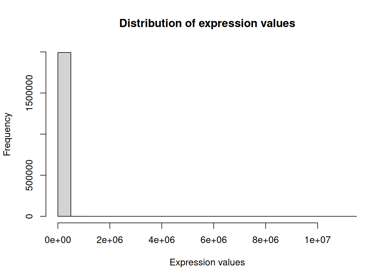
- カウントの値の頻度を見ると、ほとんどの値が非常に低い値だがごく一部非常に大きな値もあることがわかります。
- 一般にRNA-seqの発現値はこのような対数正規分布になります。
- このように値のスケールがあまりにも違いすぎるデータは理解しにくく扱いづらいので、ログ変換を行います。
ログ変換を行って発現値の分布を確認
# ログ変換
counts_log_matrix <- log2(counts_mrna_matrix + 1)
# ログ変換後のヒストグラム
hist(
counts_log_matrix,
main = "Distribution of log-transformed expression values",
xlab = "log-transformed expression values",
ylab = "Frequency"
)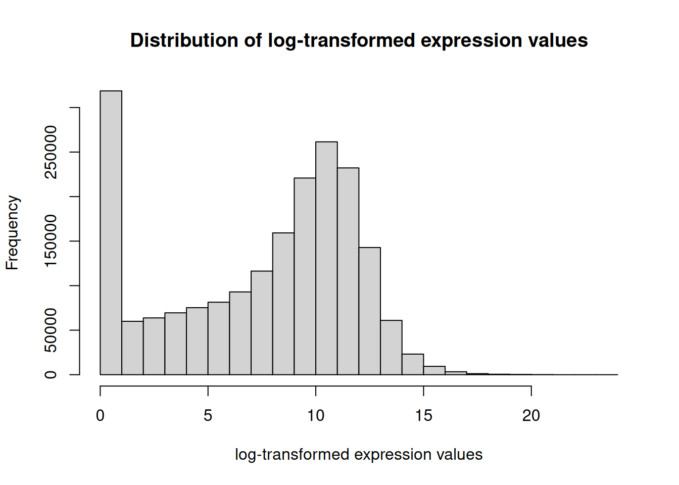
- このようにログ変換によって、桁違いだった値が小さくなり、ほとんどの値を0から15くらいで表せるようになりました。
- 値が0に近い遺伝子を除けば10付近を頂点とした山になっていることが分かります。
- 左右対称な山の分布は正規分布と呼び、log変換によって正規分布に近づいたといえます。
3. データの正規化 #
- サンプル間で比較ができるようにメディアン比正規化を行います。
- RNA-seqとは?で詳しく解説しています。
- 正規化はraw countsデータに対して行います。
library(DESeq2)- DEGを行う代表的なパッケージであるDESeq2にはメディアン比正規化の関数が用意されています。
- 発現値が0の遺伝子が含まれるとメディアン比正規化はできませんが、これは関数内部で自動的に除外されます。
- 0でなかったとしてもあまりに低すぎると正確な結果が出ないことがあるので、平均発現値が10カウント未満の遺伝子を除外することが多いです。
平均発現値が10以上の遺伝子のみを保持
# 平均発現値が10以上の遺伝子のみを保持
keep_genes <- rowMeans(counts_mrna_matrix) >= 10
filtered_counts_mrna_matrix <- counts_mrna_matrix[keep_genes, ]print(paste0("除外された遺伝子数: ", nrow(counts_mrna_matrix) - nrow(filtered_counts_mrna_matrix)))[1] "除外された遺伝子数: 3481"print(paste0("除外された遺伝子の割合: ", round((nrow(counts_mrna_matrix) - nrow(filtered_counts_mrna_matrix)) / nrow(counts_mrna_matrix) * 100, 2), "%"))[1] "除外された遺伝子の割合: 17.46%"DEseq2の関数を使ってsize factorを計算
# size factorを計算
size_factors <- estimateSizeFactorsForMatrix(filtered_counts_mrna_matrix)
# 結果を確認
head(size_factors) TCGA-D5-5540 TCGA-EI-6509 TCGA-A6-6137 TCGA-QG-A5Z2
0.6611094 1.0191326 1.0514363 1.4867364
TCGA-AA-3489 HCM-CSHL-0160-C18
1.3669717 0.6783093 サンプル毎に計算したsize factorsで割って正規化
# サンプル毎に計算したsize factorsで割って正規化
normalized_counts <- sweep(filtered_counts_mrna_matrix, 2, size_factors, "/")
# データの中身を確認
print(normalized_counts[1:5, 1:5]) TCGA-D5-5540 TCGA-EI-6509 TCGA-A6-6137 TCGA-QG-A5Z2 TCGA-AA-3489
A1BG 1.512609 3.924906 0.00000 3.363071 3.657720
A1CF 1188.910555 2696.410738 1891.69802 434.508762 480.624449
A2M 3542.529924 6484.926700 13386.45027 2968.246389 28157.130975
A2ML1 1.512609 8.831040 16.16836 4.708299 5.852353
A4GALT 72.605225 322.823556 258.69375 122.415781 771.778986正規化したデータをlog変換してヒストグラムを作成
# log変換
log_normalized_counts <- log2(normalized_counts + 1)
# 正規化かつlog変換後のヒストグラム
hist(
log_normalized_counts,
main = "Distribution of normalized expression values",
xlab = "log-normalized expression values",
ylab = "Frequency"
)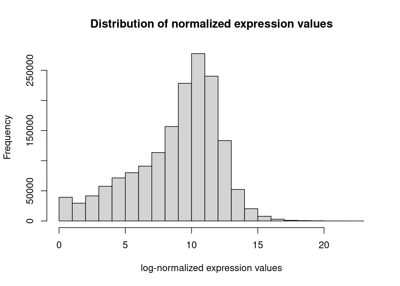
- 最終的に非常に正規分布に近い分布になりました。
- 正規分布は様々な統計解析手法で仮定される分布のため非常に扱いやすくなっています。
4. heatmapで全体像をつかむ #
- 無事に正規化できたのでheatmapを作成してみましょう。
- 今回は少しデータを追加できるように便利なheatmapパッケージを使用します。
library(ComplexHeatmap)- すべての遺伝子を使うと計算に時間がかかります。
- 今回は大腸癌の分子サブタイプ分類に用いられる遺伝子セットを使います
- 本来は一つの遺伝子セットを用いてクラスタリングしたあとに、さらに別の遺伝子セットを用いて・・・と段階的に行う方がよいですが、今回は例としてまとめて行います。
# 大腸癌の分子サブタイプ分類に用いられる遺伝子セット
## 大腸癌サブクラスタリング用の主要遺伝子セット
crc_driver_genes <- c("APC", "KRAS", "PIK3CA", "FBXW7", "SMAD4", "TCF7L2", "NRAS", "BRAF", "TP53", "CTNNB1", "PTEN", "MSH2", "MLH1", "MSH6", "PMS2", "POLE", "POLD1")
## CMS分類関連遺伝子
cms_signature_genes <- c("CDX2", "EPHB2", "HNF4A", "KRT20", "VIL1", "CEACAM5", "EPCAM", "LGR5", "ASCL2", "OLFM4", "SOX9", "BMI1", "MSI1", "DCLK1", "CD44")
## 免疫関連遺伝子セット
immune_genes <- c("CD3E", "CD8A", "GZMA", "GZMB", "PRF1", "IFNG", "TBX21", "FOXP3", "IL10", "TGFB1", "PD1", "PDL1", "CTLA4", "LAG3")
## 間質関連遺伝子
stromal_genes <- c("COL1A1", "COL1A2", "COL3A1", "FN1", "VIM", "ACTA2", "PDGFRB", "FAP", "THY1", "SPARC", "TIMP1", "VCAN")
# 遺伝子セットを結合
genes_set <- c(crc_driver_genes, cms_signature_genes, immune_genes, stromal_genes)
# log_normalized_countsに実際に存在する遺伝子のみをフィルタリング
available_genes <- intersect(genes_set, rownames(log_normalized_counts))
# 除外された遺伝子を確認
missing_genes <- setdiff(genes_set, rownames(log_normalized_counts))
print(paste0("指定した遺伝子数: ", length(genes_set)))[1] "指定した遺伝子数: 58"print(paste0("利用可能な遺伝子数: ", length(available_genes)))[1] "利用可能な遺伝子数: 56"print(paste0("除外された遺伝子数: ", length(missing_genes)))[1] "除外された遺伝子数: 2"print("除外された遺伝子:")[1] "除外された遺伝子:"print(missing_genes)[1] "PD1" "PDL1"- これまでのフィルタリング(10カウント未満の遺伝子を除外)により、指定した遺伝子セットの遺伝子がなくなってしまったことがわかります。
- もしもPD1やPDL1の研究をしているのであれば、これらの遺伝子を除外しないようにフィルタリング方法を変えたり特定の遺伝子だけ意図的に残したりする必要があります。
利用可能な遺伝子のみでheatmap用のデータを作成
# 利用可能な遺伝子のみでheatmap用のデータを作成
heatmap_data <- log_normalized_counts[available_genes, ]- 行ごとにz-scoreスケーリングを行います。
- データの平均を0、標準偏差を1にすることで、遺伝子ごとの発現パターンの相対的な変化を比較しやすくします。
行ごとにz-scoreスケーリングを行う
# 行ごとにz-scoreスケーリング
heatmap_data_scaled <- t(scale(t(heatmap_data)))
# スケーリングされたデータの確認(最初の数行、数列)
print(heatmap_data_scaled[1:5, 1:5]) TCGA-D5-5540 TCGA-EI-6509 TCGA-A6-6137 TCGA-QG-A5Z2 TCGA-AA-3489
APC -0.94538403 -1.4797431 -1.104450118 -0.51245302 -0.30314542
KRAS 1.26869736 0.5109699 0.345097246 0.11027905 -0.28421717
PIK3CA -1.68336116 -0.2764212 -0.004262841 -0.77866149 -0.04524831
FBXW7 -1.53689130 -2.5857930 -0.610560350 0.06755438 0.30084770
SMAD4 -0.01473564 -3.3935131 -0.672149570 0.35610149 -0.81051601ヒートマップの作成(列方向のクラスタリングのみ行う、列名は表示せず行名は表示する。)
# ヒートマップの作成
ComplexHeatmap::Heatmap(
heatmap_data_scaled,
name = "exp",
cluster_rows = FALSE,
cluster_columns = TRUE,
show_row_names = TRUE,
show_column_names = FALSE,
row_names_gp = gpar(fontsize = 8),
row_names_max_width = unit(6, "cm"),
row_names_side = "right",
width = unit(8, "cm"),
height = unit(14, "cm")
)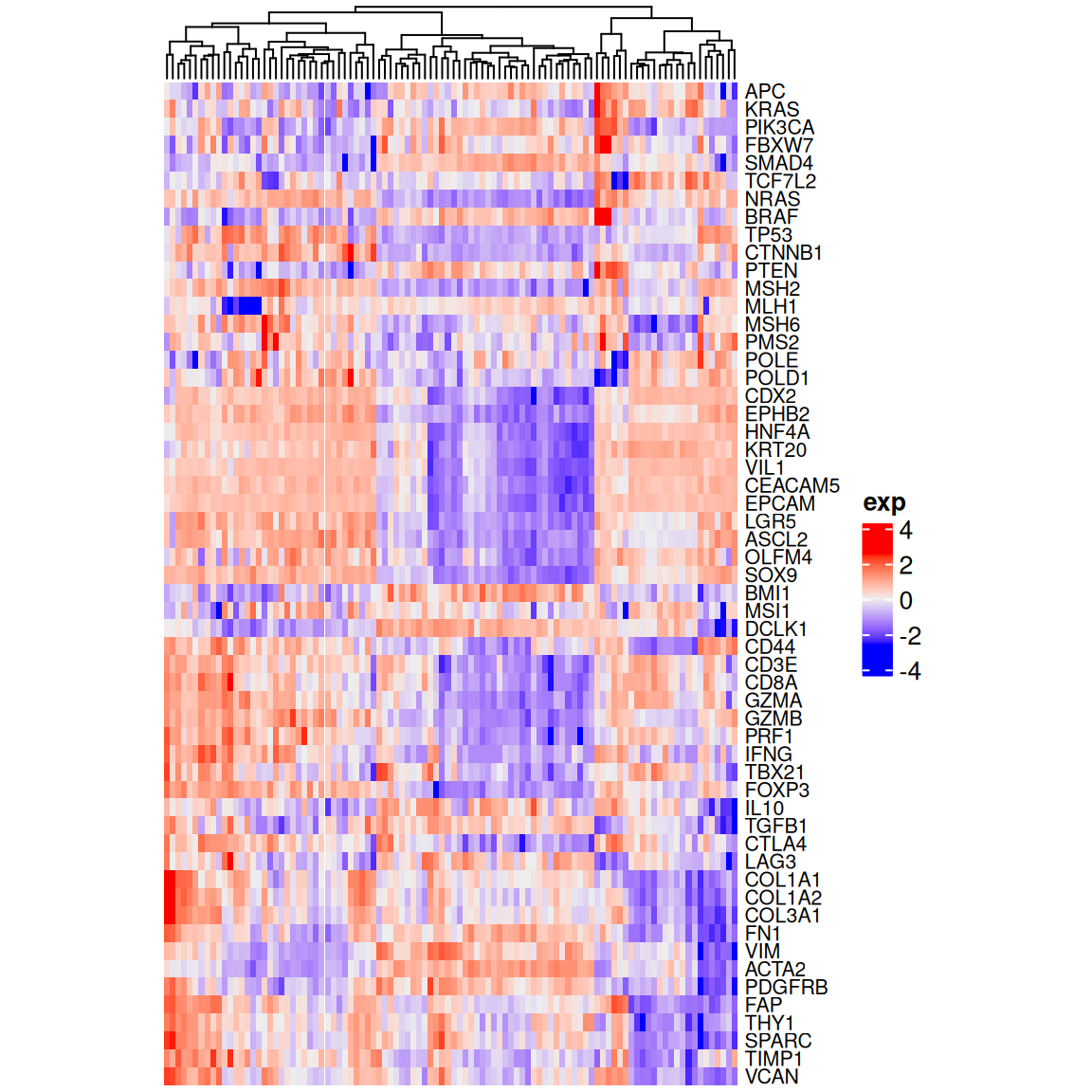
- これだとどれが腫瘍でどれが正常大腸なのかやどの遺伝子がどの遺伝子セットに属しているかが分かりません。
- annotation barを追加することで情報を追加できます。
col annotation barにするための情報をmetadataから抜き出す(stageはdiagnoses.ajcc_pathologic_stage)
# metadataからcol annotation barにしたい情報を抜き出す
col_annotation_data <- metadata %>%
select(case_id, source, diagnoses.ajcc_pathologic_stage) %>%
setNames(c("case_id", "source", "stage")) %>%
mutate(stage = if_else(is.na(stage), "Normal", stage)) %>%
column_to_rownames("case_id")
# データを確認
head(col_annotation_data) source stage
TCGA-D5-5540 TCGA_CRC Stage IIA
TCGA-EI-6509 TCGA_CRC '--
TCGA-A6-6137 TCGA_CRC Stage IIIB
TCGA-QG-A5Z2 TCGA_CRC Stage I
TCGA-AA-3489 TCGA_CRC Stage II
HCM-CSHL-0160-C18 TCGA_CRC Stage IIAtable(col_annotation_data$source) GTEx_sigmoid GTEx_transverse TCGA_CRC
25 25 50 table(col_annotation_data$stage) '-- Normal Stage I Stage II Stage IIA Stage IIB Stage III
9 50 9 4 13 1 2
Stage IIIA Stage IIIB Stage IIIC Stage IV Stage IVA Stage IVB
1 5 3 1 1 1 RColorBrewerの色パレットを使ってcol annotation barを作成
library(RColorBrewer)
# sourceの色設定
source_colors <- brewer.pal(
n = length(unique(col_annotation_data$source)),
"Set1"
)
names(source_colors) <- unique(col_annotation_data$source)
# stageの色設定
stage_colors <- colorRampPalette(brewer.pal(12, "Set3"))(length(unique(col_annotation_data$stage)))
names(stage_colors) <- unique(col_annotation_data$stage)
# col annotation barを作成
col_annotation <- HeatmapAnnotation(
df = col_annotation_data,
col = list(
source = source_colors,
stage = stage_colors
)
)
# heatmapを作成
Heatmap(
heatmap_data_scaled,
name = "exp",
cluster_rows = FALSE,
cluster_columns = TRUE,
show_row_names = TRUE,
show_column_names = FALSE,
row_names_gp = gpar(fontsize = 8),
row_names_max_width = unit(6, "cm"),
row_names_side = "right",
width = unit(8, "cm"),
height = unit(14, "cm"),
top_annotation = col_annotation
)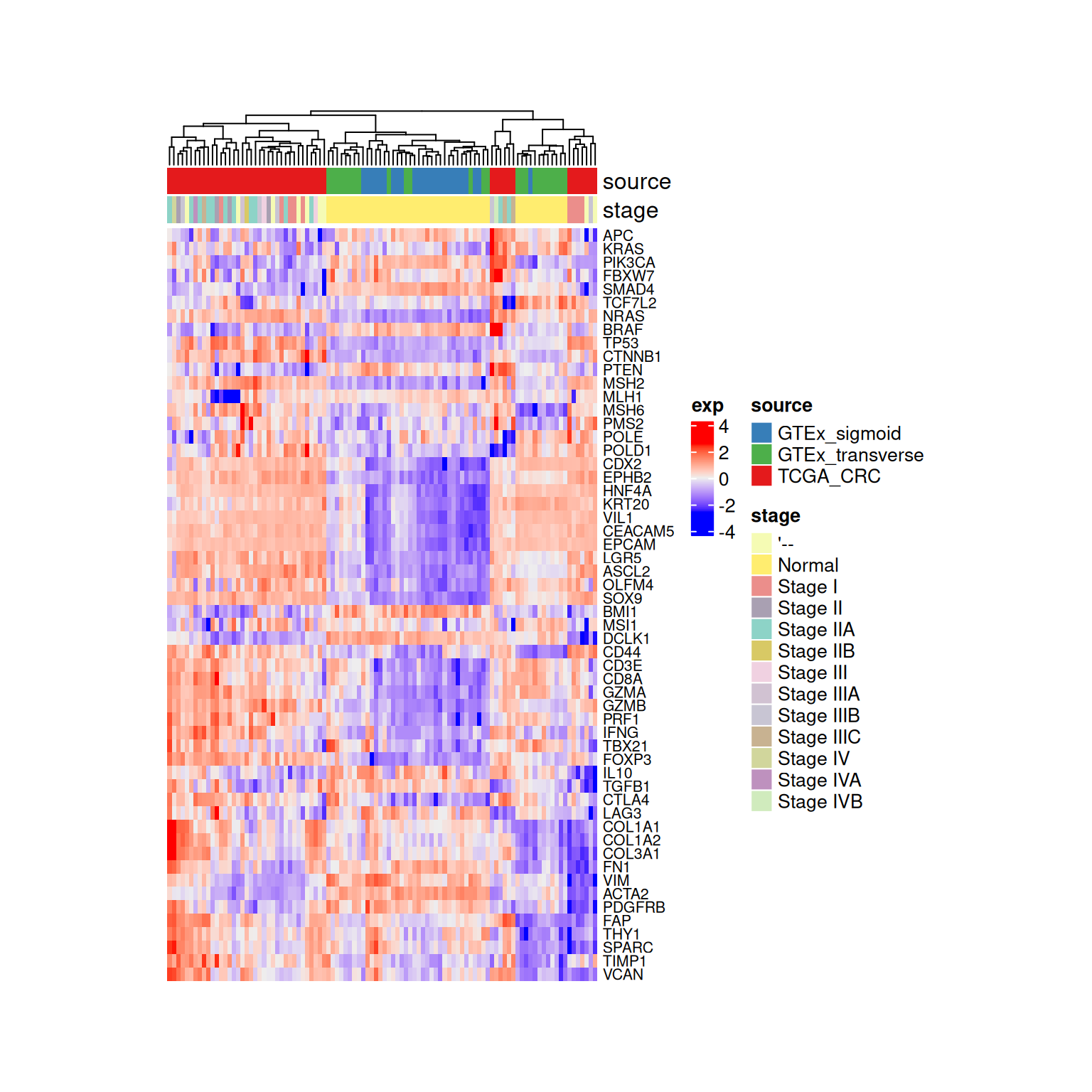
- これでサンプルの情報を追加することができました。
- 続いて遺伝子がどの遺伝子セットに属しているかを追加します。
row annotation bar用のデータをgene setから作成して色を設定しannotation barを作成
# gene setからrow annotation barを作成
row_annotation_data <- data.frame(
set_name = c(
rep("CRC driver", length(crc_driver_genes)),
rep("CMS signature", length(cms_signature_genes)),
rep("Immune", length(immune_genes)),
rep("Stromal", length(stromal_genes))
)
)
rownames(row_annotation_data) <- genes_set
# available_genesに一致する遺伝子のみを抽出
row_annotation_data <- row_annotation_data[available_genes, , drop = FALSE]
# gene setの色を設定
gene_set_colors <- brewer.pal(
n = length(unique(row_annotation_data$set_name)),
"Set2"
)
names(gene_set_colors) <- unique(row_annotation_data$set_name)
# row annotation barを作成
row_annotation <- rowAnnotation(
df = row_annotation_data,
col = list(
set_name = gene_set_colors
)
)
# heatmapを作成
Heatmap(
heatmap_data_scaled,
name = "exp",
cluster_rows = FALSE,
cluster_columns = TRUE,
show_row_names = TRUE,
show_column_names = FALSE,
row_names_gp = gpar(fontsize = 8),
row_names_max_width = unit(6, "cm"),
row_names_side = "right",
width = unit(8, "cm"),
height = unit(14, "cm"),
top_annotation = col_annotation,
left_annotation = row_annotation
)
- Stageの項目が多すぎて少々見づらくなっています。
- Stage I, II, III, IVというようにまとめてみましょう。
# 現在のStageの項目を確認
table(col_annotation_data$stage) '-- Normal Stage I Stage II Stage IIA Stage IIB Stage III
9 50 9 4 13 1 2
Stage IIIA Stage IIIB Stage IIIC Stage IV Stage IVA Stage IVB
1 5 3 1 1 1 ステージ情報を整理
# ステージ情報を整理
col_annotation_data_updated <- col_annotation_data %>%
mutate(stage_simplified = case_when(
stage == "'--" ~ "Unknown",
stage == "Normal" ~ "Normal",
str_detect(stage, "^Stage IV") ~ "Stage_IV",
str_detect(stage, "^Stage III") ~ "Stage_III",
str_detect(stage, "^Stage II") ~ "Stage_II",
str_detect(stage, "^Stage I") ~ "Stage_I",
TRUE ~ "Other"
))
# 整理後のステージ分布を確認
table(col_annotation_data_updated$stage_simplified) Normal Stage_I Stage_II Stage_III Stage_IV Unknown
50 9 18 11 3 9 table(col_annotation_data$stage, col_annotation_data_updated$stage_simplified)
Normal Stage_I Stage_II Stage_III Stage_IV Unknown
'-- 0 0 0 0 0 9
Normal 50 0 0 0 0 0
Stage I 0 9 0 0 0 0
Stage II 0 0 4 0 0 0
Stage IIA 0 0 13 0 0 0
Stage IIB 0 0 1 0 0 0
Stage III 0 0 0 2 0 0
Stage IIIA 0 0 0 1 0 0
Stage IIIB 0 0 0 5 0 0
Stage IIIC 0 0 0 3 0 0
Stage IV 0 0 0 0 1 0
Stage IVA 0 0 0 0 1 0
Stage IVB 0 0 0 0 1 0ステージ情報の整理後、色設定を更新
# ステージ情報の整理後、色設定を更新
stage_colors_updated <- brewer.pal(
n = min(length(unique(col_annotation_data_updated$stage_simplified)), 11),
"Dark2"
)
names(stage_colors_updated) <- unique(col_annotation_data_updated$stage_simplified)
# stage列は使わないのでcol_annotation_data_updatedから削除
col_annotation_data_updated <- col_annotation_data_updated %>%
select(!stage)
# 色設定を確認
print(stage_colors_updated) Stage_II Unknown Stage_III Stage_I Stage_IV Normal
"#1B9E77" "#D95F02" "#7570B3" "#E7298A" "#66A61E" "#E6AB02" 更新されたcol annotation barを作成しheatmapを作成
# 更新されたcol annotation barを作成
col_annotation_updated <- HeatmapAnnotation(
df = col_annotation_data_updated,
col = list(
source = source_colors,
stage_simplified = stage_colors_updated
)
)
# 整理されたステージ情報を使ったheatmapを作成
Heatmap(
heatmap_data_scaled,
name = "exp",
cluster_rows = FALSE,
cluster_columns = TRUE,
show_row_names = TRUE,
show_column_names = FALSE,
row_names_gp = gpar(fontsize = 8),
row_names_max_width = unit(6, "cm"),
row_names_side = "right",
width = unit(8, "cm"),
height = unit(14, "cm"),
top_annotation = col_annotation_updated,
left_annotation = row_annotation
)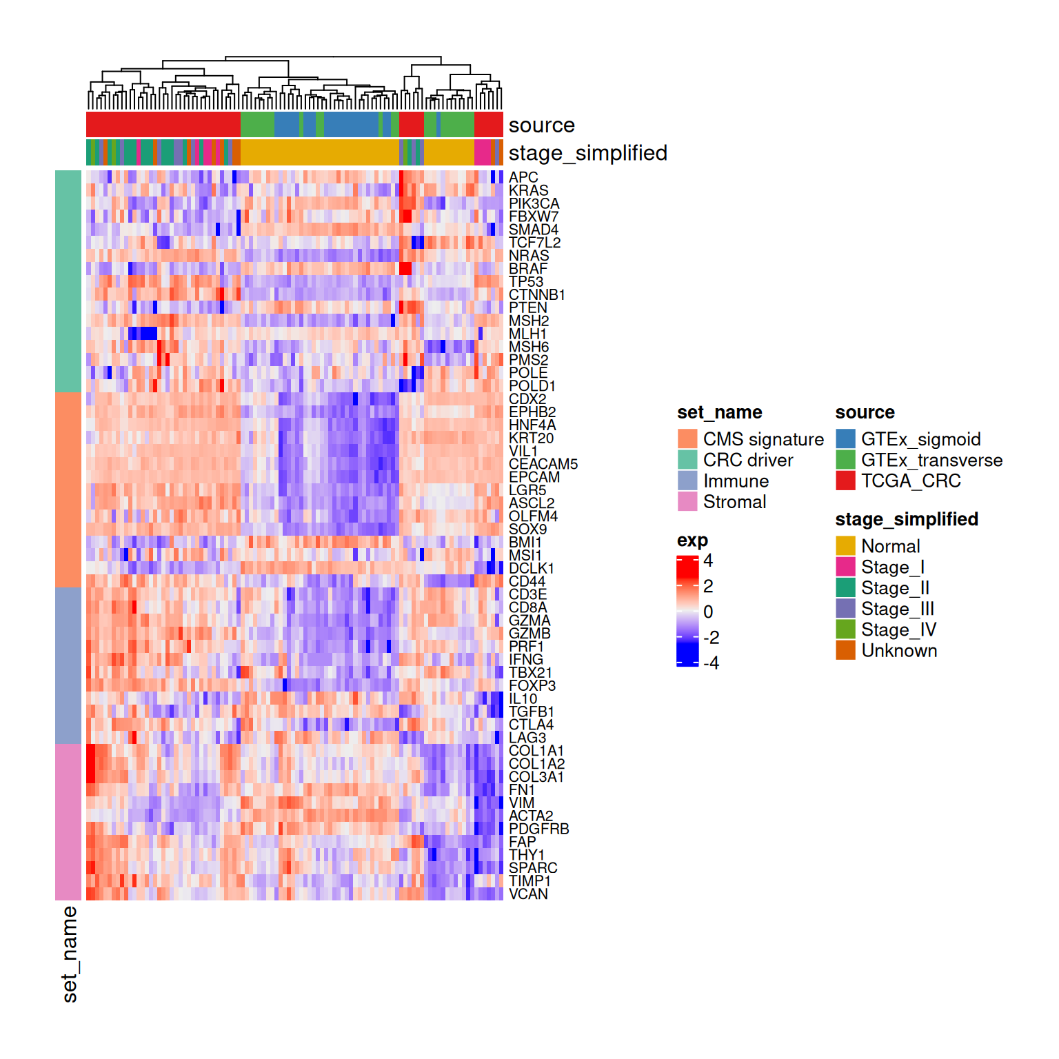
- このようにheatmapは臨床情報と遺伝子発現量の両方を可視化することができます。
- このような可視化はデータの全体像を把握するのに非常に便利です。
5. PCAでデータのばらつきをつかむ #
- 次にデータのばらつきをつかむためにPCAを行います。
- Principal Component Analysis (PCA)はデータの次元を削減するための手法です。
- RNA-seqデータは1サンプルにつき20000遺伝子=20000次元のデータとなります。
- このような高次元データは可視化が困難です。
- PCAはデータのばらつきを主成分軸に分解し、それぞれの軸に対してどの程度の情報を持っているかを可視化します。
- 20000次元のデータを2次元に圧縮して人間が理解できるような形にするということです。
PCAを計算してリザルトの構造を表示
# PCAを行う(行をサンプルにする必要があるので転置する)
pca_result <- prcomp(t(log_normalized_counts))
# resultの構造を確認
str(pca_result)List of 5
$ sdev : num [1:100] 136 60 44.5 35.8 28.1 ...
$ rotation: num [1:16457, 1:100] 0.01699 -0.01958 0.00588 0.00362 0.00951 ...
..- attr(*, "dimnames")=List of 2
.. ..$ : chr [1:16457] "A1BG" "A1CF" "A2M" "A2ML1" ...
.. ..$ : chr [1:100] "PC1" "PC2" "PC3" "PC4" ...
$ center : Named num [1:16457] 4.14 7.74 14.06 3.48 9.45 ...
..- attr(*, "names")= chr [1:16457] "A1BG" "A1CF" "A2M" "A2ML1" ...
$ scale : logi FALSE
$ x : num [1:100, 1:100] -156.4 -120.7 -141.7 -149 -77.9 ...
..- attr(*, "dimnames")=List of 2
.. ..$ : chr [1:100] "TCGA-D5-5540" "TCGA-EI-6509" "TCGA-A6-6137" "TCGA-QG-A5Z2" ...
.. ..$ : chr [1:100] "PC1" "PC2" "PC3" "PC4" ...
- attr(*, "class")= chr "prcomp"pca_result$sdevには各主成分の標準偏差が格納されています。これを2乗すると分散になります。- 各主成分の分散を、すべての主成分の分散の合計で割ることで、各主成分がデータ全体のばらつきのうちどれくらいの割合を説明しているか(寄与率)がわかります。
- 計算して棒グラフで表示してみましょう。
主成分の寄与率を棒グラフで可視化(barplot関数)
# 主成分の寄与率を棒グラフで可視化
barplot(
pca_result$sdev^2 / sum(pca_result$sdev^2),
main = "PCA contribution rates",
xlab = "Principal Components",
ylab = "Contribution Rate",
names.arg = paste0("PC", 1:length(pca_result$sdev))
)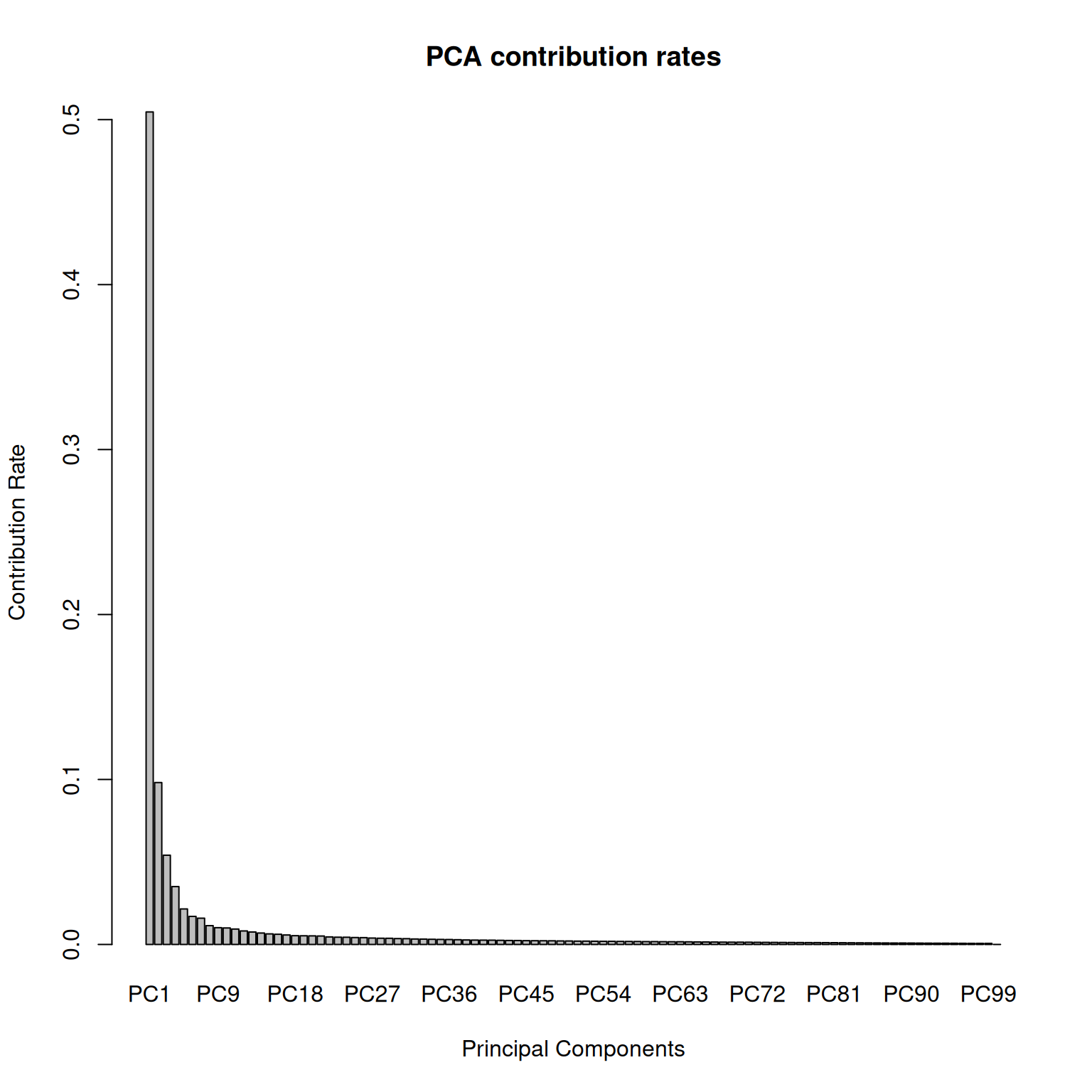
- PC1(最初の主成分)が最も多くの情報を持っており、PCが進むにつれて寄与率が小さくなっていることがわかります。
- 次に、最も情報量の多いPC1とPC2を使って、サンプルがどのように分布しているかを2次元の散布図で見てみましょう。
pca_result$xには各サンプルが各主成分に対して持つスコアが格納されています。これを利用します。
PCAの結果とメタデータ(source列)を結合したデータフレームを作成(サンプルはsample_id列にする)
# PCAの結果とメタデータを結合したデータフレームを作成
plot_data_pca_gg <- data.frame(
PC1 = pca_result$x[, 1],
PC2 = pca_result$x[, 2],
source = metadata$source,
sample_id = rownames(pca_result$x)
)
# データの中身を確認
head(plot_data_pca_gg) PC1 PC2 source sample_id
TCGA-D5-5540 -156.38728 -82.446074 TCGA_CRC TCGA-D5-5540
TCGA-EI-6509 -120.68225 -49.843552 TCGA_CRC TCGA-EI-6509
TCGA-A6-6137 -141.74386 9.706455 TCGA_CRC TCGA-A6-6137
TCGA-QG-A5Z2 -149.04311 7.815018 TCGA_CRC TCGA-QG-A5Z2
TCGA-AA-3489 -77.93359 -33.290015 TCGA_CRC TCGA-AA-3489
HCM-CSHL-0160-C18 -56.86226 1.675592 TCGA_CRC HCM-CSHL-0160-C18ggplot2で散布図をプロット
# ggplot2でプロット
ggplot(plot_data_pca_gg, aes(x = PC1, y = PC2)) +
geom_point(size = 3, alpha = 0.7) +
labs(
title = "PCA Plot",
x = paste0("PC1 (", round((pca_result$sdev[1]^2 / sum(pca_result$sdev^2)) * 100, 1), "%)"),
y = paste0("PC2 (", round((pca_result$sdev[2]^2 / sum(pca_result$sdev^2)) * 100, 1), "%)"),
color = "Sample Source",
) +
theme_classic() +
theme(
plot.title = element_text(size = 16, face = "bold", hjust = 0.5),
axis.title = element_text(size = 14, face = "bold"),
axis.text = element_text(size = 12),
legend.title = element_text(size = 14, face = "bold"),
legend.text = element_text(size = 12)
)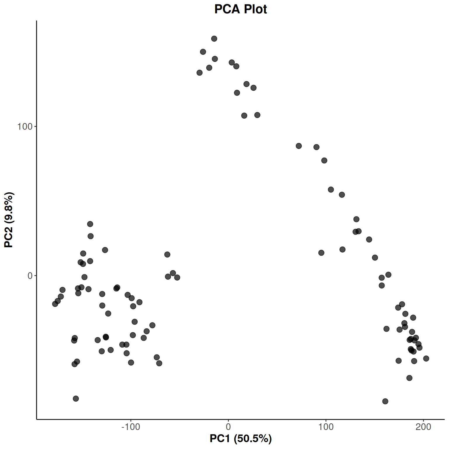
- このプロットでは、横軸にPC1、縦軸にPC2を取り、各サンプルを点で表示しています。
- 次は色分けをしてもう少しわかりやすくしてみましょう。
ggplot2で散布図をプロット(色分け)
# ggplot2でプロット(色分け)
ggplot(plot_data_pca_gg, aes(x = PC1, y = PC2)) +
geom_point(aes(color = source), size = 3, alpha = 0.7) +
scale_color_manual(values = source_colors) +
labs(
title = "PCA Plot",
x = paste0("PC1 (", round((pca_result$sdev[1]^2 / sum(pca_result$sdev^2)) * 100, 1), "%)"),
y = paste0("PC2 (", round((pca_result$sdev[2]^2 / sum(pca_result$sdev^2)) * 100, 1), "%)"),
color = "Sample Source",
) +
theme_classic() +
theme(
plot.title = element_text(size = 16, face = "bold", hjust = 0.5),
axis.title = element_text(size = 14, face = "bold"),
axis.text = element_text(size = 12),
legend.title = element_text(size = 14, face = "bold"),
legend.text = element_text(size = 12)
)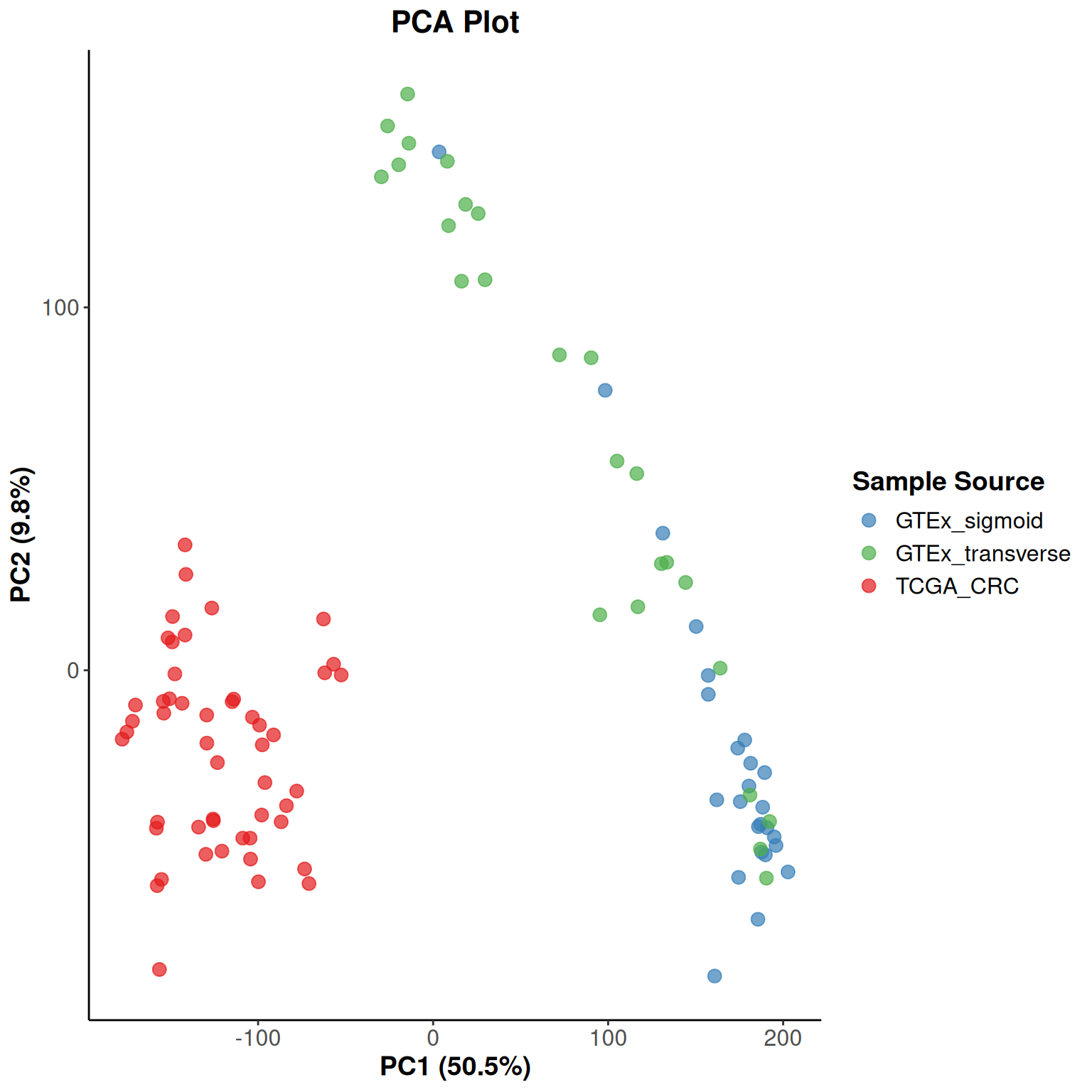
- このように、大腸がんと正常大腸粘膜はかなり分離していることが分かります。
- 一方で横行結腸とS状結腸はかなり近いところにいて一部混ざっていますが、ある程度別の集団であることを示しています。
- このようなグループ分けを自動的に行う方法(クラスタリング)も試してみましょう。
k-meansという手法によってクラスタリングを行ってみます。
k-meansクラスタリングを行い、クラスタリング結果を信頼楕円としてプロット
# k-meansクラスタリング (PC1とPC2を使用)
set.seed(123)
kmeans_obj <- kmeans(plot_data_pca_gg[, c("PC1", "PC2")], centers = 3, nstart = 25)
plot_data_pca_gg$cluster <- factor(kmeans_obj$cluster)
# クラスタの中心点をデータフレームとして準備
cluster_centers_gg <- as.data.frame(kmeans_obj$centers)
colnames(cluster_centers_gg) <- c("PC1", "PC2")
# クラスタを中心点から信頼楕円を書くためにクラスタIDを追加
cluster_centers_gg$cluster <- factor(1:nrow(cluster_centers_gg))
# ggplot2でプロット
ggplot(plot_data_pca_gg, aes(x = PC1, y = PC2)) +
geom_point(aes(color = source, shape = cluster), size = 3, alpha = 0.7) +
stat_ellipse(aes(fill = cluster), geom = "polygon", alpha = 0.15, type = "t", level = 0.95, show.legend = FALSE, color = "darkgrey") +
scale_color_manual(values = source_colors) +
scale_fill_brewer(palette = "Pastel2") +
scale_shape_manual(values = c("1" = 16, "2" = 17, "3" = 15)) +
labs(
title = "PCA Plot",
x = paste0("PC1 (", round((pca_result$sdev[1]^2 / sum(pca_result$sdev^2)) * 100, 1), "%)"),
y = paste0("PC2 (", round((pca_result$sdev[2]^2 / sum(pca_result$sdev^2)) * 100, 1), "%)"),
color = "Sample Source",
shape = "K-means Cluster"
) +
theme_classic() +
theme(
plot.title = element_text(size = 16, face = "bold", hjust = 0.5),
axis.title = element_text(size = 14, face = "bold"),
axis.text = element_text(size = 12),
legend.title = element_text(size = 14, face = "bold"),
legend.text = element_text(size = 12)
)
- 大腸がんと正常大腸粘膜ははっきりクラスタリングすることができました。
- 横行結腸とS状結腸の正常粘膜については完全に分けることはできませんが、集団の大部分が所属するクラスターに分けることはできました。
- 今回はすべての遺伝子を使いましたが、多くの場合ほとんどの遺伝子は大きく変動していないのでがんと正常大腸を分けることくらいしかできませんでした。
- 大腸がんをさらに細かく分けるためには、ある程度重要な遺伝子を絞り込んでからPCAを行う必要があります。
- heatmapの時に使ったgene setの遺伝子を使ってみましょう。
# heatmapの時に使ったgene setのデータを確認
print(row_annotation_data) set_name
APC CRC driver
KRAS CRC driver
PIK3CA CRC driver
FBXW7 CRC driver
SMAD4 CRC driver
TCF7L2 CRC driver
NRAS CRC driver
BRAF CRC driver
TP53 CRC driver
CTNNB1 CRC driver
PTEN CRC driver
MSH2 CRC driver
MLH1 CRC driver
MSH6 CRC driver
PMS2 CRC driver
POLE CRC driver
POLD1 CRC driver
CDX2 CMS signature
EPHB2 CMS signature
HNF4A CMS signature
KRT20 CMS signature
VIL1 CMS signature
CEACAM5 CMS signature
EPCAM CMS signature
LGR5 CMS signature
ASCL2 CMS signature
OLFM4 CMS signature
SOX9 CMS signature
BMI1 CMS signature
MSI1 CMS signature
DCLK1 CMS signature
CD44 CMS signature
CD3E Immune
CD8A Immune
GZMA Immune
GZMB Immune
PRF1 Immune
IFNG Immune
TBX21 Immune
FOXP3 Immune
IL10 Immune
TGFB1 Immune
CTLA4 Immune
LAG3 Immune
COL1A1 Stromal
COL1A2 Stromal
COL3A1 Stromal
FN1 Stromal
VIM Stromal
ACTA2 Stromal
PDGFRB Stromal
FAP Stromal
THY1 Stromal
SPARC Stromal
TIMP1 Stromal
VCAN Stromaltibbleに変換
# tibbleに変換
gene_set_tibble <- row_annotation_data |>
rownames_to_column(var = "gene_name") |>
as_tibble()
# データの中身を確認
print(gene_set_tibble)# A tibble: 56 × 2
gene_name set_name
<chr> <chr>
1 APC CRC driver
2 KRAS CRC driver
3 PIK3CA CRC driver
4 FBXW7 CRC driver
5 SMAD4 CRC driver
6 TCF7L2 CRC driver
7 NRAS CRC driver
8 BRAF CRC driver
9 TP53 CRC driver
10 CTNNB1 CRC driver
# ℹ 46 more rows- これらの遺伝子だけを使って、大腸がんだけをPCAプロットしてみましょう。
大腸がんのサンプルの行だけを抽出
# metadataから大腸がんのサンプルの行だけを抽出
tumor_samples_metadata <- metadata |>
filter(source == "TCGA_CRC")
head(tumor_samples_metadata)```
# A tibble: 6 × 210
  case_id     source project.project_id cases.consent_type cases.days_to_consent
  <chr>       <chr>  <chr>              <chr>              <chr>
1 TCGA-D5-55… TCGA_… TCGA-COAD          Informed Consent   20
2 TCGA-EI-65… TCGA_… TCGA-READ          Informed Consent   0
3 TCGA-A6-61… TCGA_… TCGA-COAD          Informed Consent   0
4 TCGA-QG-A5… TCGA_… TCGA-COAD          Informed Consent   49
5 TCGA-AA-34… TCGA_… TCGA-COAD          Informed Consent   31
6 HCM-CSHL-0… TCGA_… HCMI-CMDC          '--                '--
# ℹ 205 more variables: cases.days_to_lost_to_followup <chr>,
#   cases.disease_type <chr>, cases.index_date <chr>,
#   cases.lost_to_followup <chr>, cases.primary_site <chr>,
#   demographic.age_at_index <chr>, demographic.age_is_obfuscated <chr>,
#   demographic.cause_of_death <chr>, demographic.cause_of_death_source <chr>,
#   demographic.country_of_birth <chr>,
# demographic.country_of_residence_at_enrollment <chr>, …log_normalized_countsから大腸がんのサンプルの列だけを抽出
# log_normalized_countsから大腸がんのサンプルの列だけを抽出
tumor_log_normalized_counts <- log_normalized_counts[, tumor_samples_metadata$case_id]

tumor_log_normalized_counts[1:5, 1:5] TCGA-D5-5540 TCGA-EI-6509 TCGA-A6-6137 TCGA-QG-A5Z2 TCGA-AA-3489
A1BG 1.329186 2.300096 0.000000 2.125344 2.219624
A1CF 10.216637 11.397360 10.886229 8.766558 8.911765
A2M 11.790972 12.663097 13.708594 11.535881 14.781264
A2ML1 1.329186 3.297344 4.101680 2.513061 2.776599
A4GALT 6.201736 8.339064 8.020667 6.947383 9.593912dim(tumor_log_normalized_counts)[1] 16457 50使用するgene setの遺伝子行だけを抽出
# 使用するgene setの遺伝子行だけを抽出
tumor_gene_set_log_normalized_counts <- tumor_log_normalized_counts[gene_set_tibble$gene_name, ]

tumor_gene_set_log_normalized_counts[1:5, 1:5] TCGA-D5-5540 TCGA-EI-6509 TCGA-A6-6137 TCGA-QG-A5Z2 TCGA-AA-3489
APC 9.940582 9.574465 9.831598 10.237207 10.38061
KRAS 11.824451 11.461010 11.381450 11.268820 11.07960
PIK3CA 8.961879 9.976906 10.173252 9.614568 10.14368
FBXW7 9.275326 8.763883 9.727003 10.057651 10.17140
SMAD4 11.526786 8.476560 10.933299 11.861563 10.80839dim(tumor_gene_set_log_normalized_counts)[1] 56 50- うまくデータを抽出できたらPCAを行ってplotしてみましょう。
- 今回はsourceは一つしかないのでStageで色分けしてみましょう。
PCAを行って結果をメタデータと結合したデータフレームを作成
# PCAを行う(行をサンプルにする必要があるので転置する)
pca_result <- prcomp(t(tumor_gene_set_log_normalized_counts))

# PCAの結果とメタデータを結合したデータフレームを作成
plot_data_pca_gg <- data.frame(
  PC1 = pca_result$x[, 1],
  PC2 = pca_result$x[, 2],
  stage = tumor_samples_metadata$diagnoses.ajcc_pathologic_stage,
  sample_id = rownames(pca_result$x)
)

head(plot_data_pca_gg)
PC1 PC2 stage sample_id
TCGA-D5-5540 1.041493 -4.475991 Stage IIA TCGA-D5-5540
TCGA-EI-6509 3.471889 7.542652 '-- TCGA-EI-6509
TCGA-A6-6137 5.181010 1.625038 Stage IIIB TCGA-A6-6137
TCGA-QG-A5Z2 6.057406 -3.254991 Stage I TCGA-QG-A5Z2
TCGA-AA-3489 -7.073449 3.741021 Stage II TCGA-AA-3489
HCM-CSHL-0160-C18 -3.227502 1.648932 Stage IIA HCM-CSHL-0160-C18ステージ情報を整理
# ステージ情報を整理
plot_data_pca_gg <- plot_data_pca_gg %>%
    mutate(stage_simplified = case_when(
        stage == "'--" ~ "Unknown",
        stage == "Normal" ~ "Normal",
        str_detect(stage, "^Stage IV") ~ "Stage_IV",
        str_detect(stage, "^Stage III") ~ "Stage_III",
        str_detect(stage, "^Stage II") ~ "Stage_II",
        str_detect(stage, "^Stage I") ~ "Stage_I",
        TRUE ~ "Other"
    ))

head(plot_data_pca_gg)
PC1 PC2 stage sample_id
TCGA-D5-5540 1.041493 -4.475991 Stage IIA TCGA-D5-5540
TCGA-EI-6509 3.471889 7.542652 '-- TCGA-EI-6509
TCGA-A6-6137 5.181010 1.625038 Stage IIIB TCGA-A6-6137
TCGA-QG-A5Z2 6.057406 -3.254991 Stage I TCGA-QG-A5Z2
TCGA-AA-3489 -7.073449 3.741021 Stage II TCGA-AA-3489
HCM-CSHL-0160-C18 -3.227502 1.648932 Stage IIA HCM-CSHL-0160-C18
stage_simplified
TCGA-D5-5540 Stage_II
TCGA-EI-6509 Unknown
TCGA-A6-6137 Stage_III
TCGA-QG-A5Z2 Stage_I
TCGA-AA-3489 Stage_II
HCM-CSHL-0160-C18 Stage_IItable(plot_data_pca_gg$stage, plot_data_pca_gg$stage_simplified) Stage_I Stage_II Stage_III Stage_IV Unknown
'-- 0 0 0 0 9
Stage I 9 0 0 0 0
Stage II 0 4 0 0 0
Stage IIA 0 13 0 0 0
Stage IIB 0 1 0 0 0
Stage III 0 0 2 0 0
Stage IIIA 0 0 1 0 0
Stage IIIB 0 0 5 0 0
Stage IIIC 0 0 3 0 0
Stage IV 0 0 0 1 0
Stage IVA 0 0 0 1 0
Stage IVB 0 0 0 1 0- k-meansクラスタリングしてplotします。
k-meansクラスタリングしてplot
# k-meansクラスタリング (PC1とPC2を使用)
set.seed(123)
kmeans_obj <- kmeans(plot_data_pca_gg[, c("PC1", "PC2")], centers = 3, nstart = 25)
plot_data_pca_gg$cluster <- factor(kmeans_obj$cluster)

# クラスタの中心点をデータフレームとして準備
cluster_centers_gg <- as.data.frame(kmeans_obj$centers)
colnames(cluster_centers_gg) <- c("PC1", "PC2")

# クラスタを中心点から信頼楕円を書くためにクラスタIDを追加
cluster_centers_gg$cluster <- factor(1:nrow(cluster_centers_gg))

# ggplot2でプロット
ggplot(plot_data_pca_gg, aes(x = PC1, y = PC2)) +
  geom_point(aes(color = stage_simplified, shape = cluster), size = 3, alpha = 0.7) +
  stat_ellipse(aes(fill = cluster), geom = "polygon", alpha = 0.15, type = "t", level = 0.95, show.legend = FALSE, color = "darkgrey") +
  scale_color_manual(values = stage_colors_updated) +
  scale_fill_brewer(palette = "Pastel2") +
  scale_shape_manual(values = c("1" = 16, "2" = 17, "3" = 15)) +
  labs(
    title = "PCA Plot",
    x = paste0("PC1 (", round((pca_result$sdev[1]^2 / sum(pca_result$sdev^2)) * 100, 1), "%)"),
    y = paste0("PC2 (", round((pca_result$sdev[2]^2 / sum(pca_result$sdev^2)) * 100, 1), "%)"),
    color = "Stage",
    shape = "K-means Cluster"
  ) +
  theme_classic() +
  theme(
    plot.title = element_text(size = 16, face = "bold", hjust = 0.5),
    axis.title = element_text(size = 14, face = "bold"),
    axis.text = element_text(size = 12),
    legend.title = element_text(size = 14, face = "bold"),
    legend.text = element_text(size = 12)
  )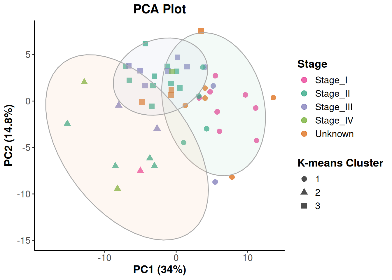
- k-meansクラスタリングは中心点の数を調整することができます。
- 4つにしてみましょう。
k-meansクラスタリング (PC1とPC2を使用)、中心点を4つにしてplot
# k-meansクラスタリング (PC1とPC2を使用)
set.seed(123)
kmeans_obj <- kmeans(plot_data_pca_gg[, c("PC1", "PC2")], centers = 4, nstart = 25)
plot_data_pca_gg$cluster <- factor(kmeans_obj$cluster)

# クラスタの中心点をデータフレームとして準備
cluster_centers_gg <- as.data.frame(kmeans_obj$centers)
colnames(cluster_centers_gg) <- c("PC1", "PC2")

# クラスタを中心点から信頼楕円を書くためにクラスタIDを追加
cluster_centers_gg$cluster <- factor(1:nrow(cluster_centers_gg))

# ggplot2でプロット
ggplot(plot_data_pca_gg, aes(x = PC1, y = PC2)) +
  geom_point(aes(color = stage_simplified, shape = cluster), size = 3, alpha = 0.7) +
  stat_ellipse(aes(fill = cluster), geom = "polygon", alpha = 0.15, type = "t", level = 0.95, show.legend = FALSE, color = "darkgrey") +
  scale_color_manual(values = stage_colors_updated) +
  scale_fill_brewer(palette = "Pastel2") +
  scale_shape_manual(values = c("1" = 16, "2" = 17, "3" = 15, "4" = 18)) +
  labs(
    title = "PCA Plot",
    x = paste0("PC1 (", round((pca_result$sdev[1]^2 / sum(pca_result$sdev^2)) * 100, 1), "%)"),
    y = paste0("PC2 (", round((pca_result$sdev[2]^2 / sum(pca_result$sdev^2)) * 100, 1), "%)"),
    color = "Stage",
    shape = "K-means Cluster"
  ) +
  theme_classic() +
  theme(
    plot.title = element_text(size = 16, face = "bold", hjust = 0.5),
    axis.title = element_text(size = 14, face = "bold"),
    axis.text = element_text(size = 12),
    legend.title = element_text(size = 14, face = "bold"),
    legend.text = element_text(size = 12)
  )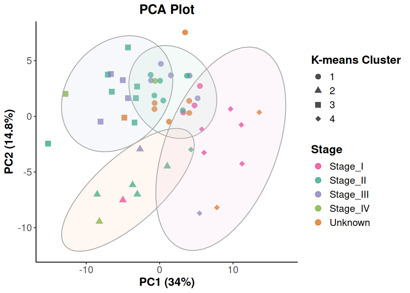
- このように、heatmapとは違った形でサンプルのばらつきを可視化することができます。
6. 追加演習 #
- ここまでの演習では、データの前処理や可視化を行いました。
- 今回はメディアン比正規化したデータについて可視化を行いましたが、他の正規化だと結果はどのように変わるでしょうか?
- TPM正規化したデータも用意したので、同様の可視化を行って結果を比べてみましょう。
- また、例えばDEseq2パッケージにはPCAに最適化された正規化方法が実装されています(rlog, vstなど)。
- 余裕があったらこれらの正規化方法を試してみてください。